
Eonia Cosmetics set out to change the skincare aisle one clean formula at a time. We gave the brand behind those formulas a visual identity and strategic foundation with the same intention baked into the products: pure, balanced, and built to last.
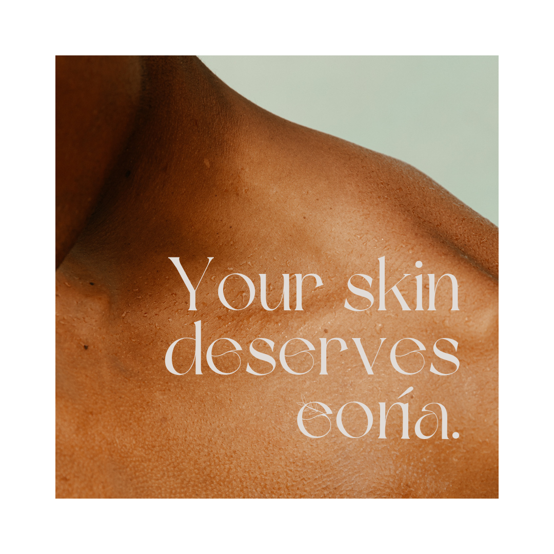
Eonia had a real product and a real belief system, but the brand around it hadn't caught up. The founder was running a one-woman operation, which left little time or capacity to shape a cohesive identity. The pieces existed in fragments, a logo here, some copy there, with no unifying system to make the brand feel as considered as what was inside the jar.
For a clean skincare line, that gap mattered. Eco-conscious shoppers research before they buy, and they judge credibility on presentation. Without a consistent identity, Eonia risked looking newer and smaller than the years of research behind it.
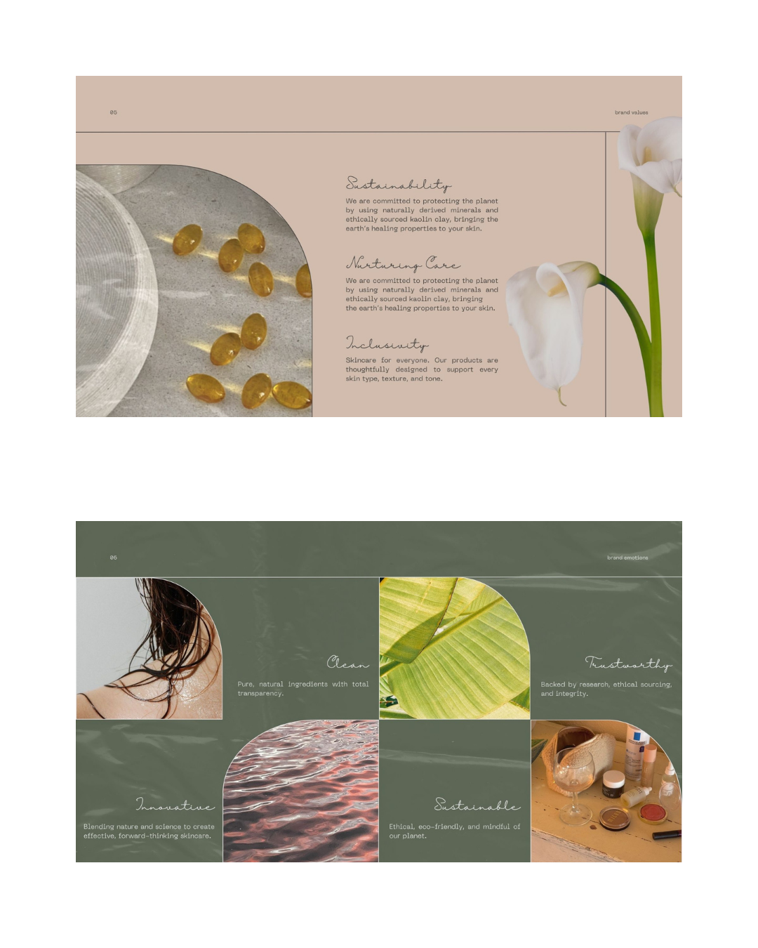
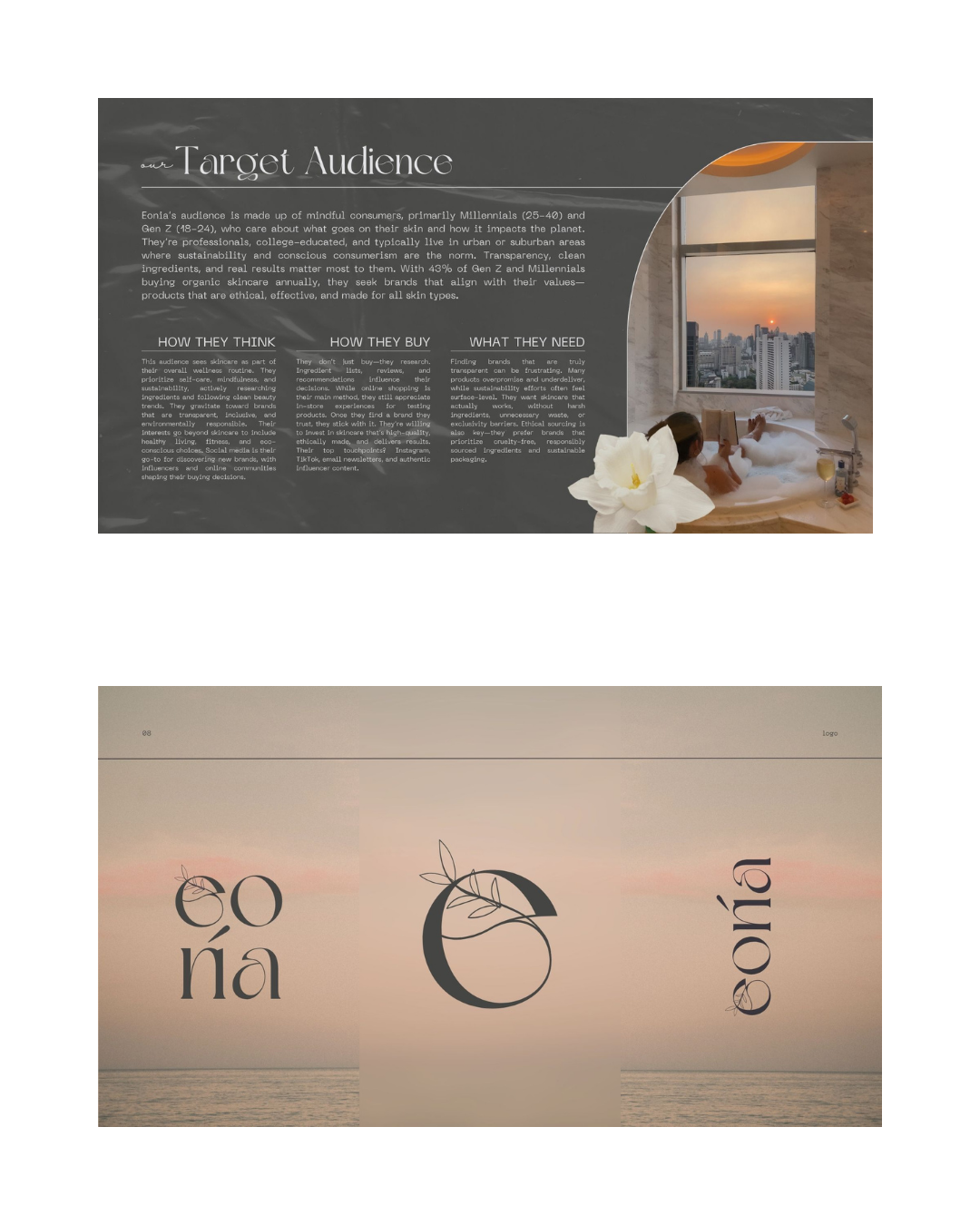
We started with clarity, not color. Before designing anything, we rebuilt Eonia's core narrative around a single idea already at the heart of the product: balance. Nature and science, purity and performance, skin and planet. From there we sharpened the mission, vision, values, and personality into language the brand could actually use, then mapped the eco-conscious millennial and Gen Z audience Eonia was built to serve.
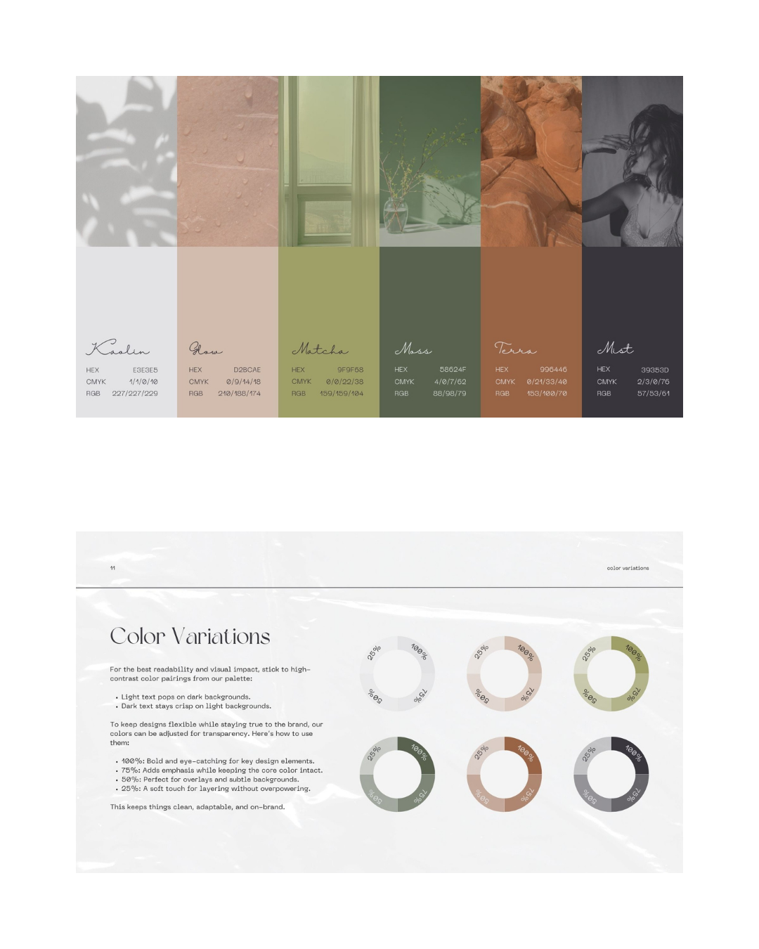
With the strategy locked, we translated it into a full visual identity: two mood board directions, a refreshed logo and variations, a typography system, and a natural, earth-drawn color palette, all documented in a complete brand book. We rounded it out with collateral and application guides so Jada could carry the brand across every platform without guessing. The full system was delivered in roughly five weeks.


Explore more projects
projects